

My Role
Lead Designer — Visual Design, Interaction Design, Prototyping, User Testing
Timeline
May - July 2022
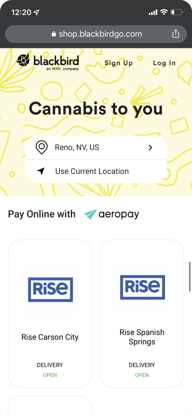
Product / Project Overview
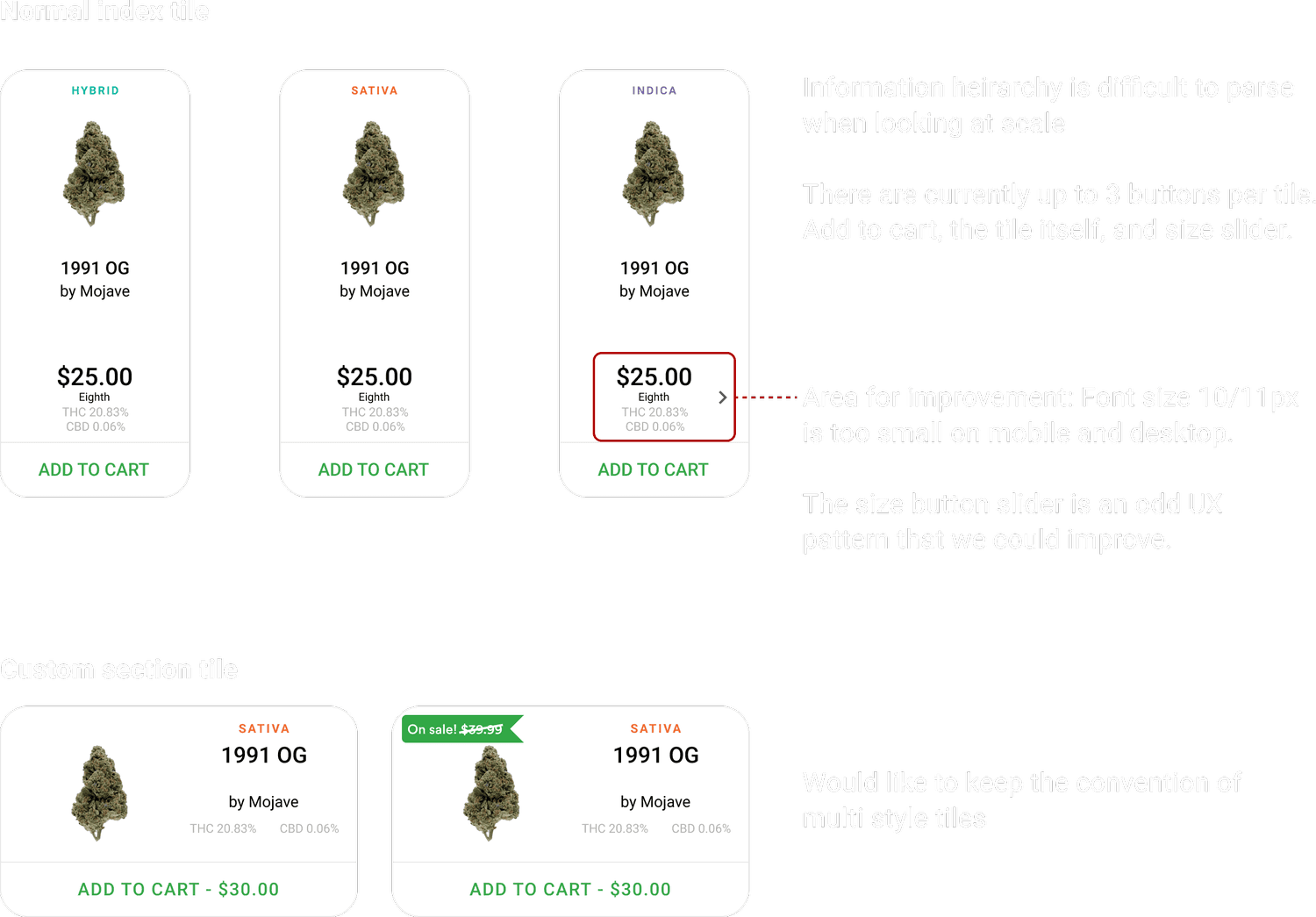
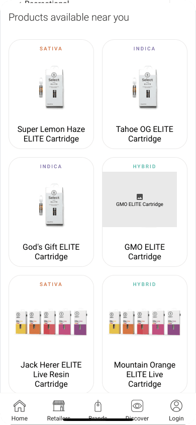
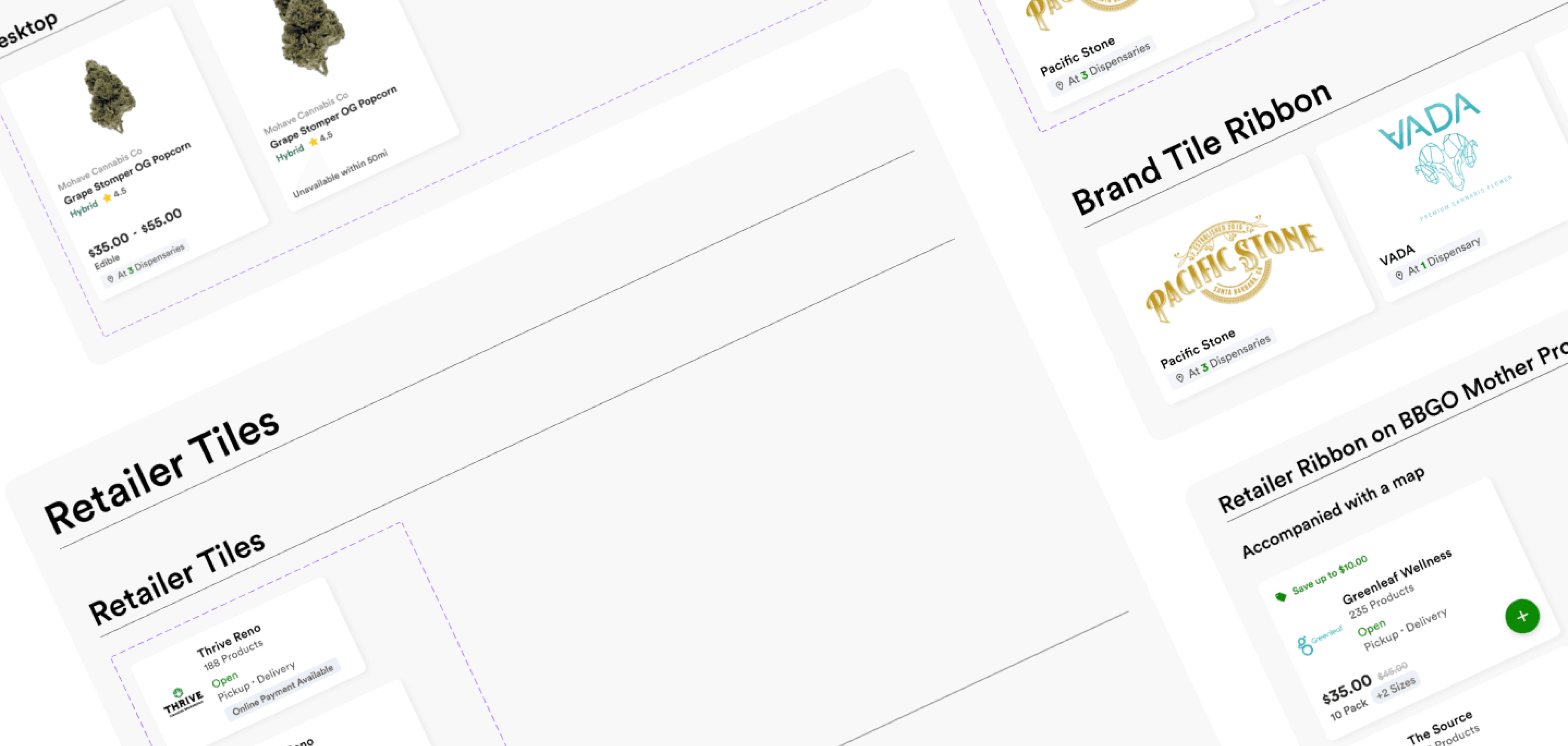
Redesign the product card to be visually more competitive and to allow for more space within the tile for future feature development (bundles, location info, badges, etc.)
Design Goals
Improve shopper experience and meet modern accessibility standards.
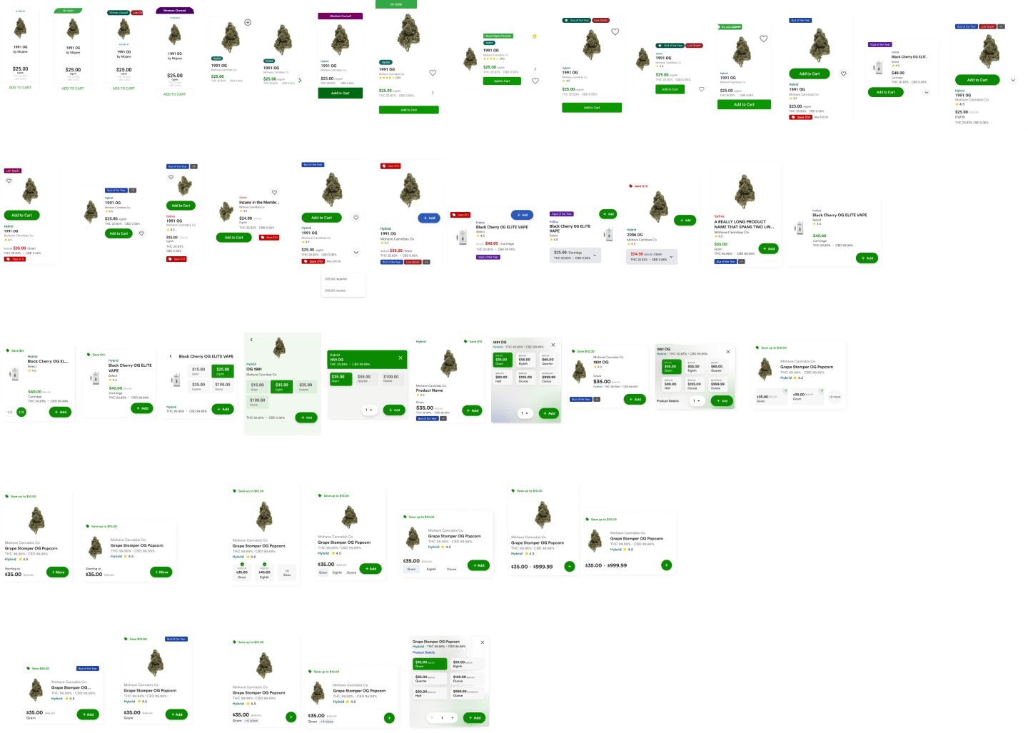
Old Tiles
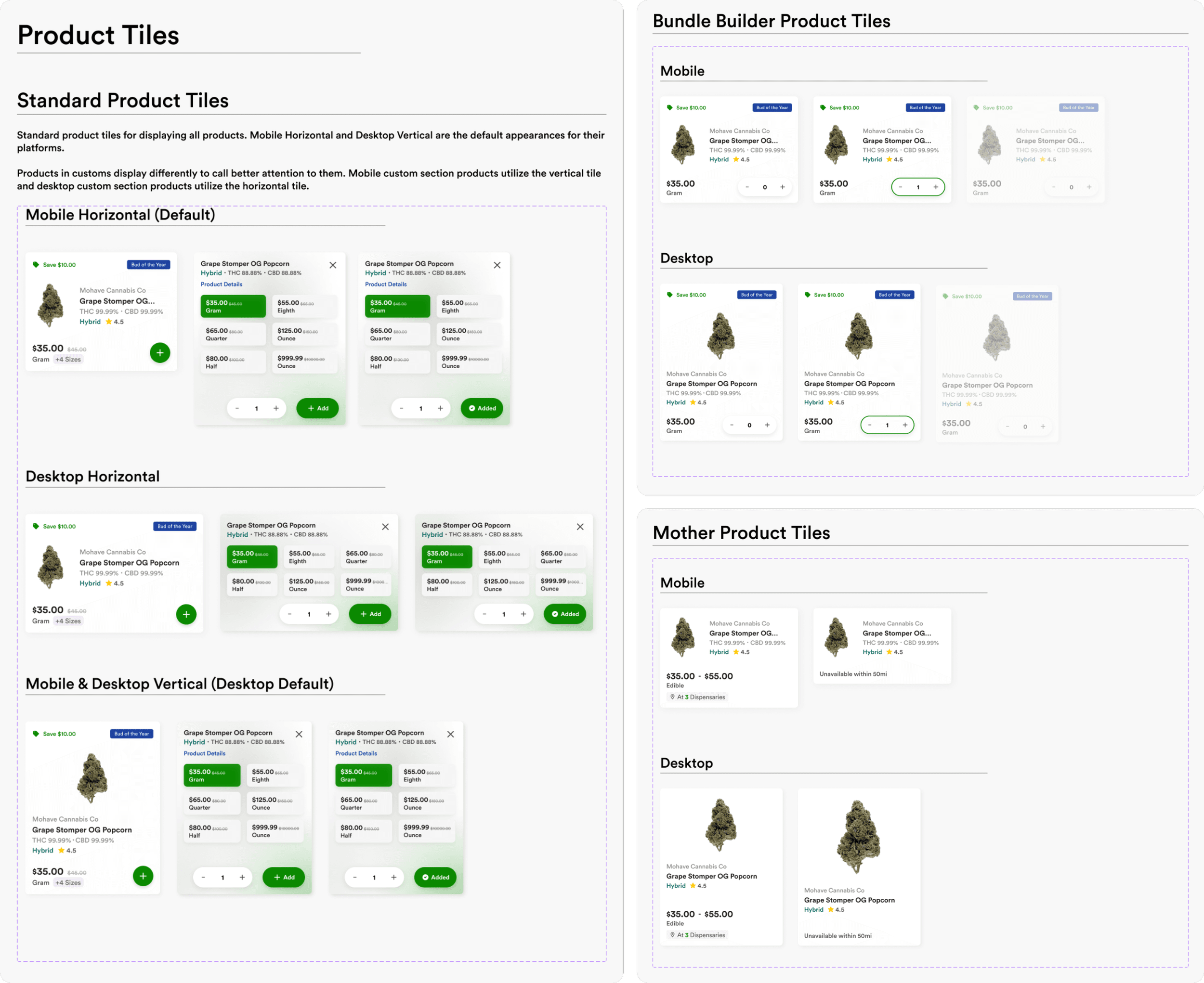
New Tiles
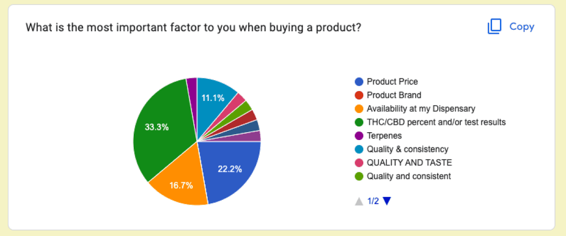
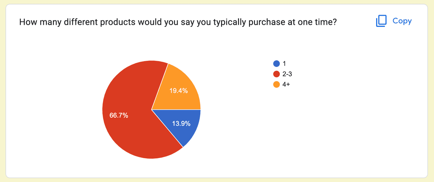
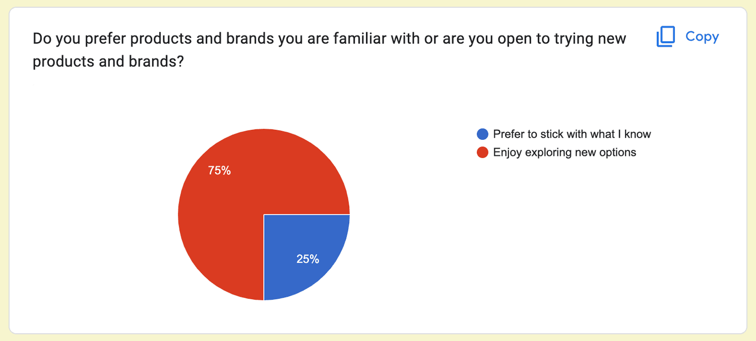
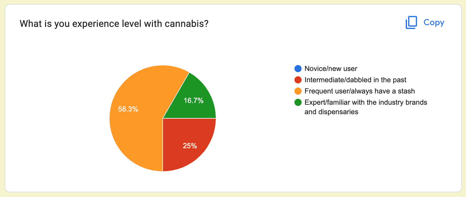
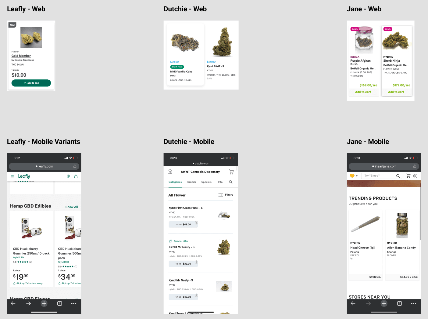
User Survey
Design Exploration

Product / Project Overview
Design Goals
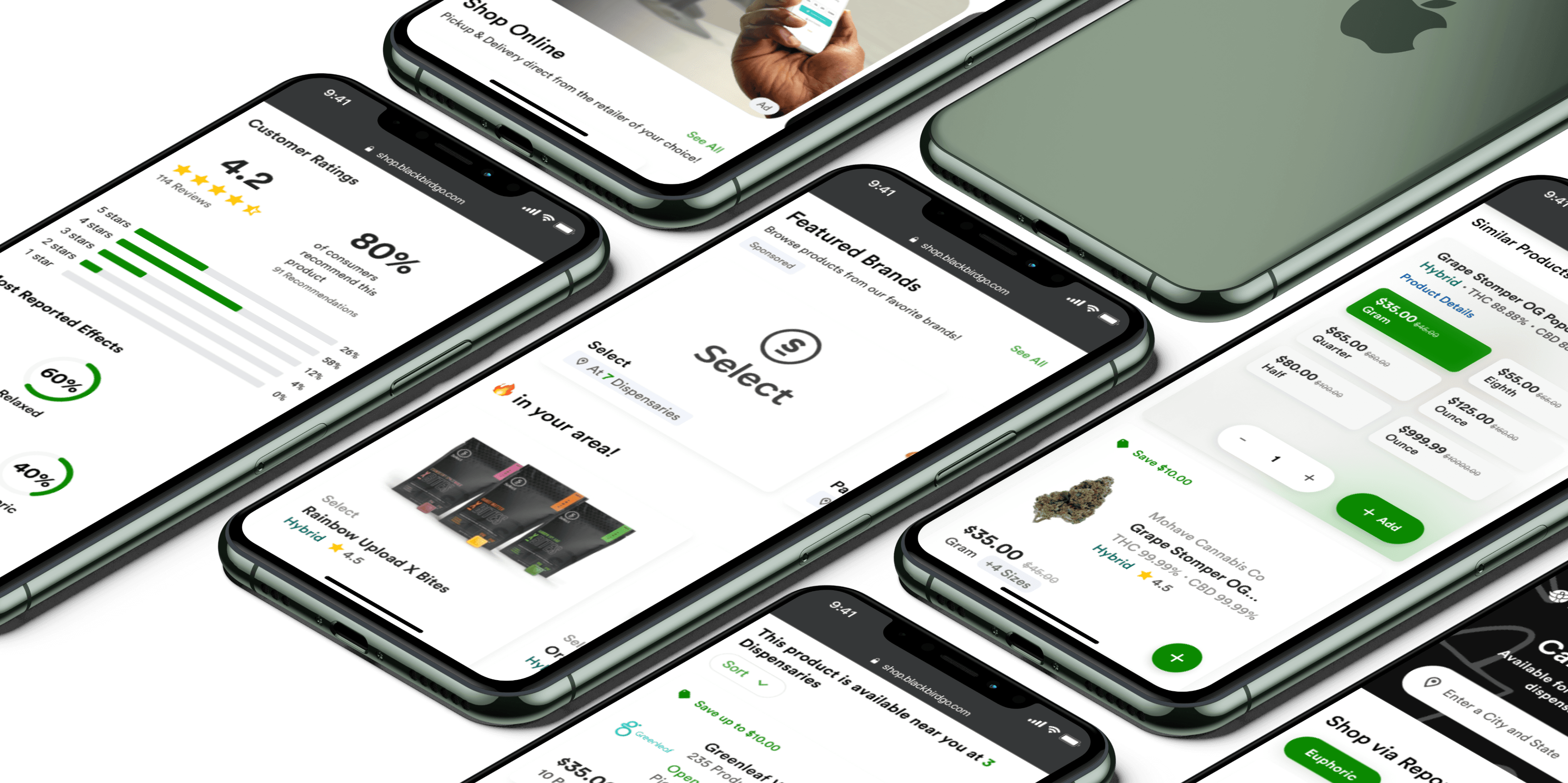
Prototype Video
Original Screens
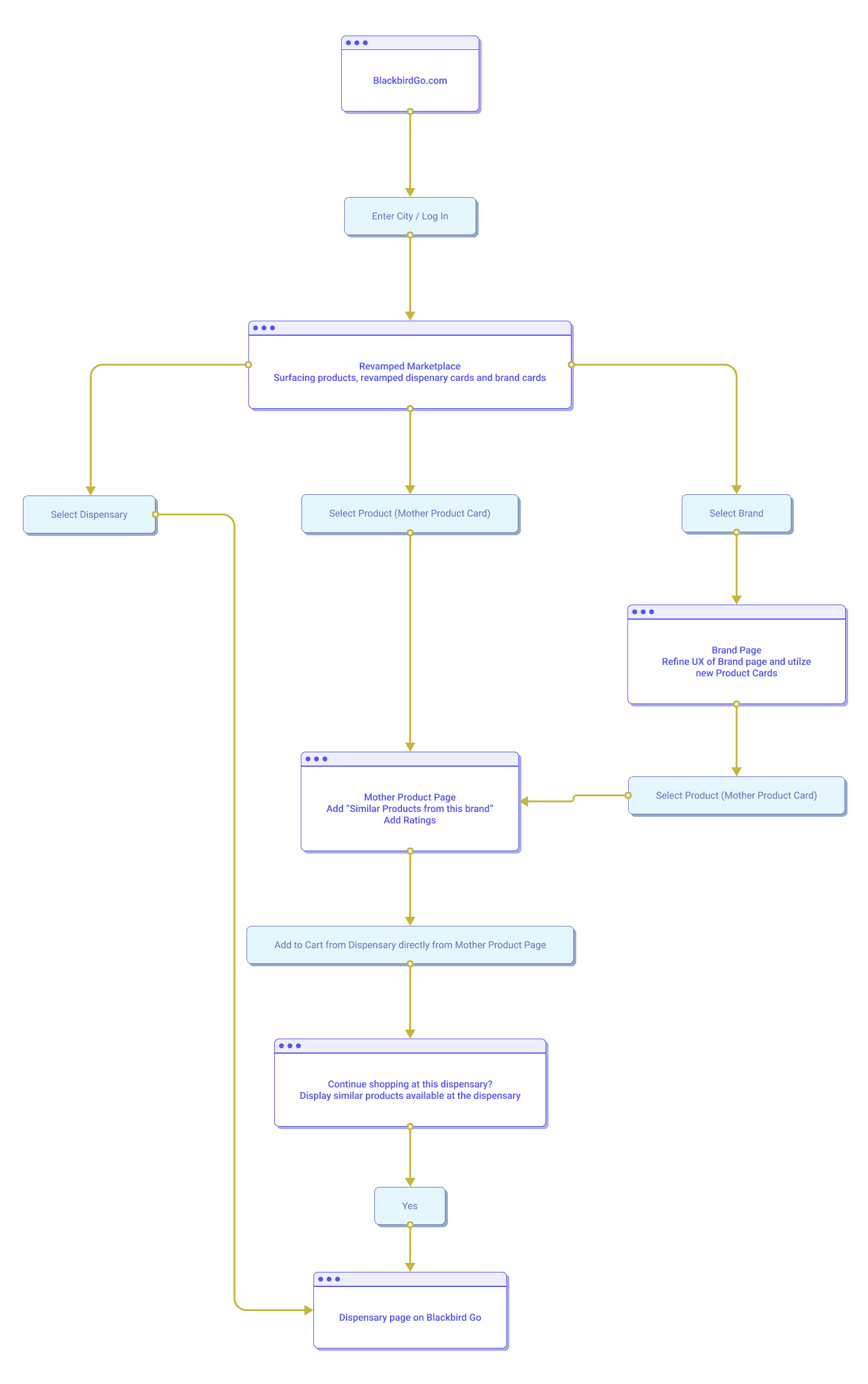
User Flow
Revamped Screens
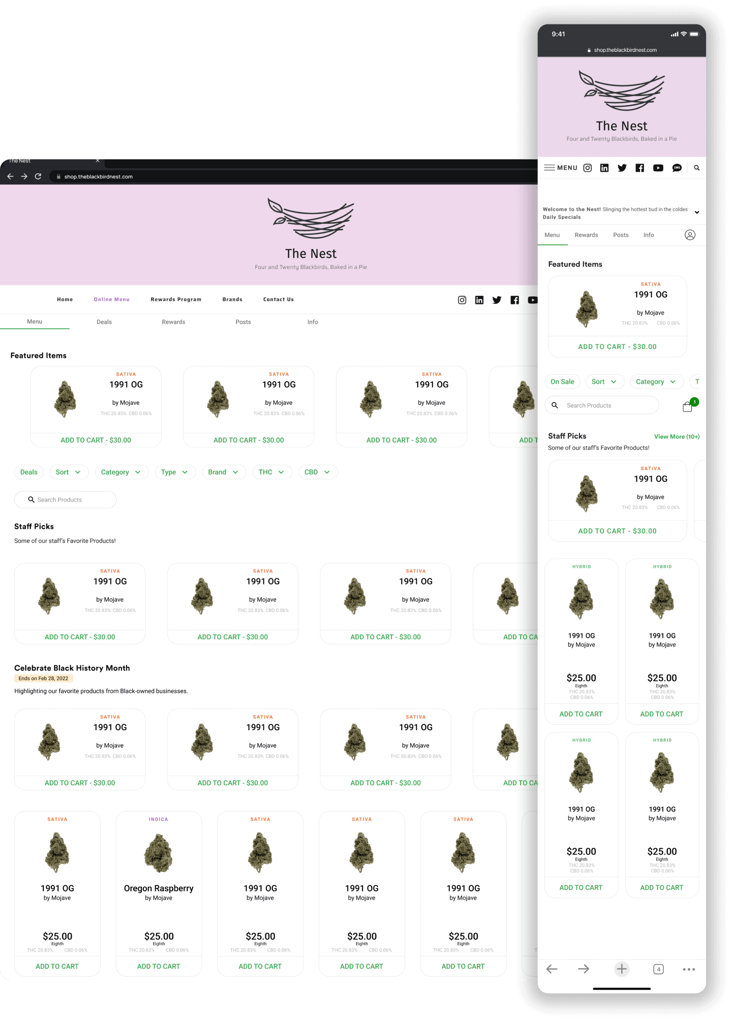
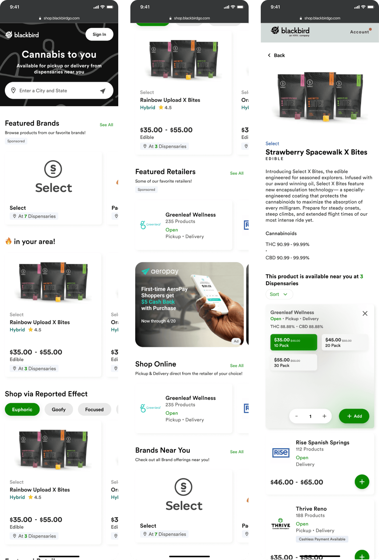
One of the larger aspects for this project included fully revamped UX for the home page of the marketplace and numerous component updates as well as differentiated flows based on new/returning shoppers.
The other large change was to surface Blackbird’s massive catalog of Mother Products so shoppers could browse specific products across Dispensaries easier.
The revamped header/nav was still a work in progress and likely would have been pushed to v2.
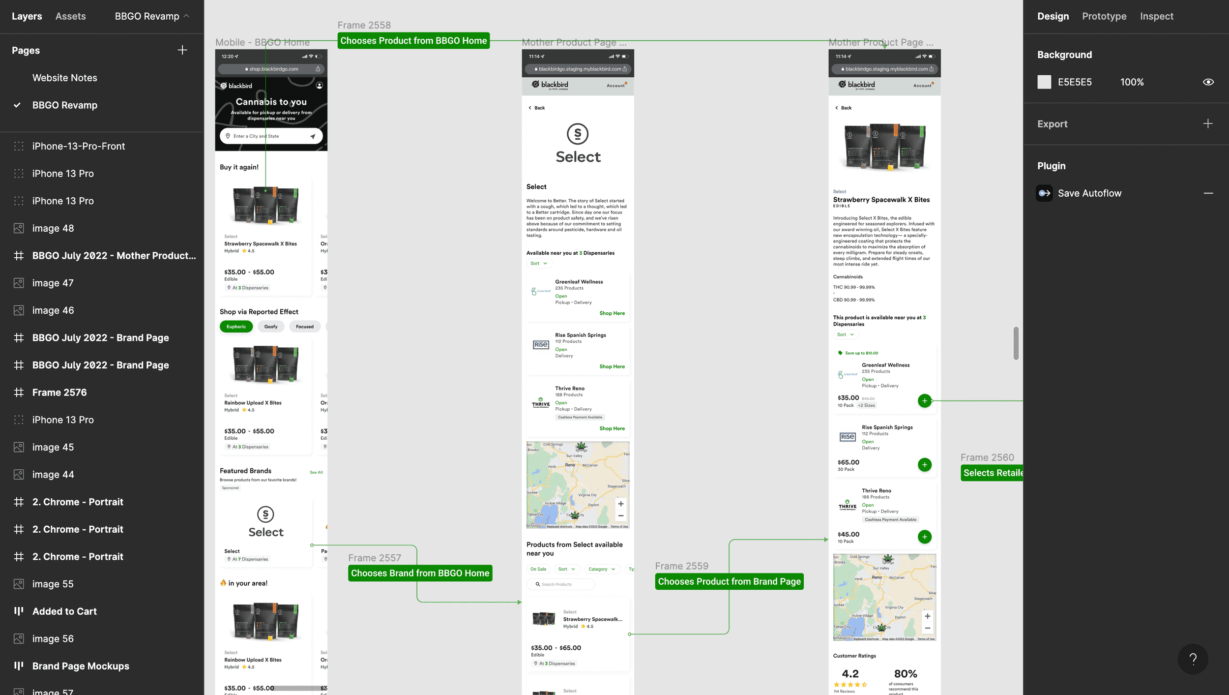
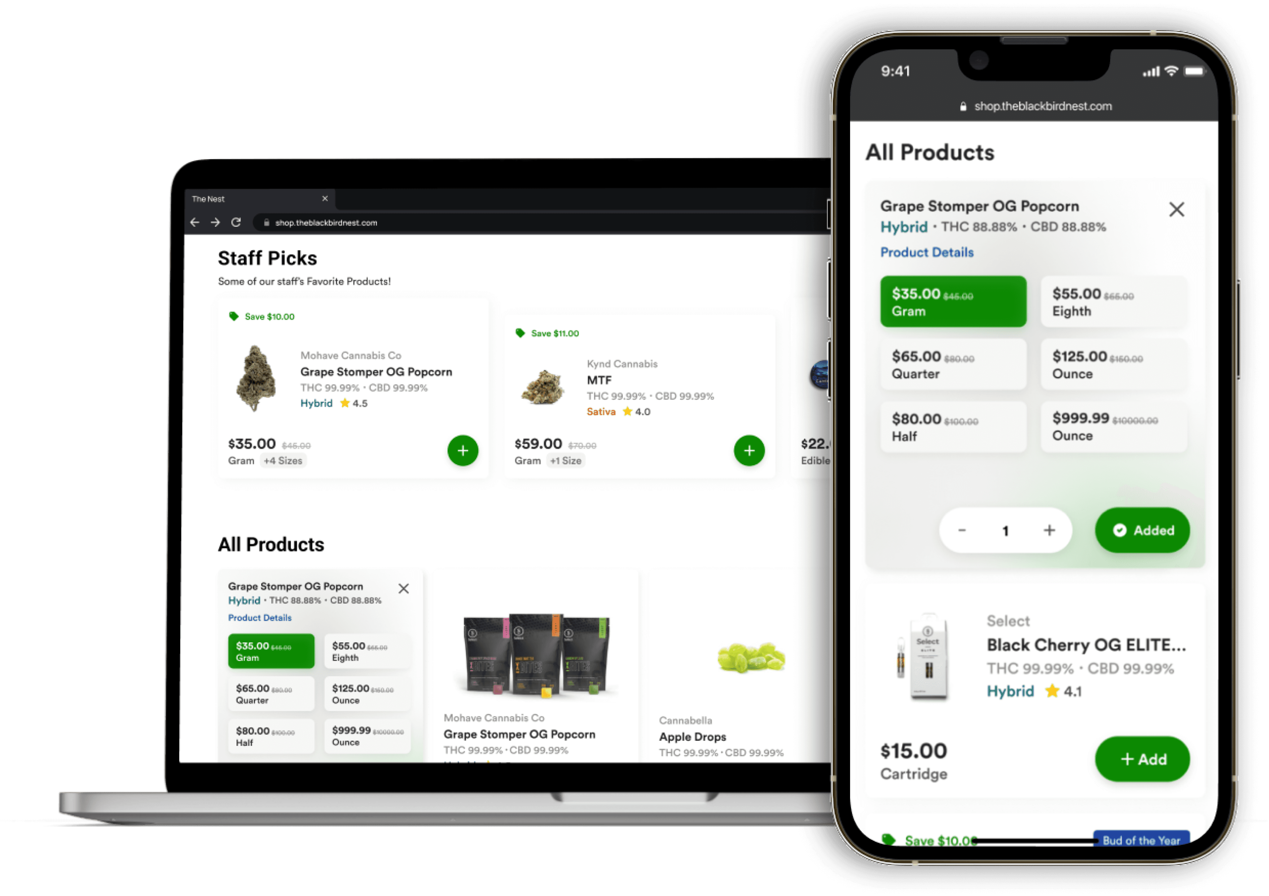
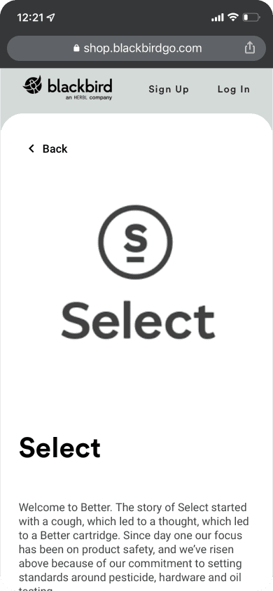
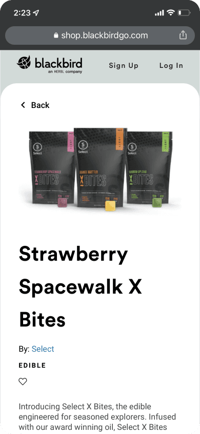
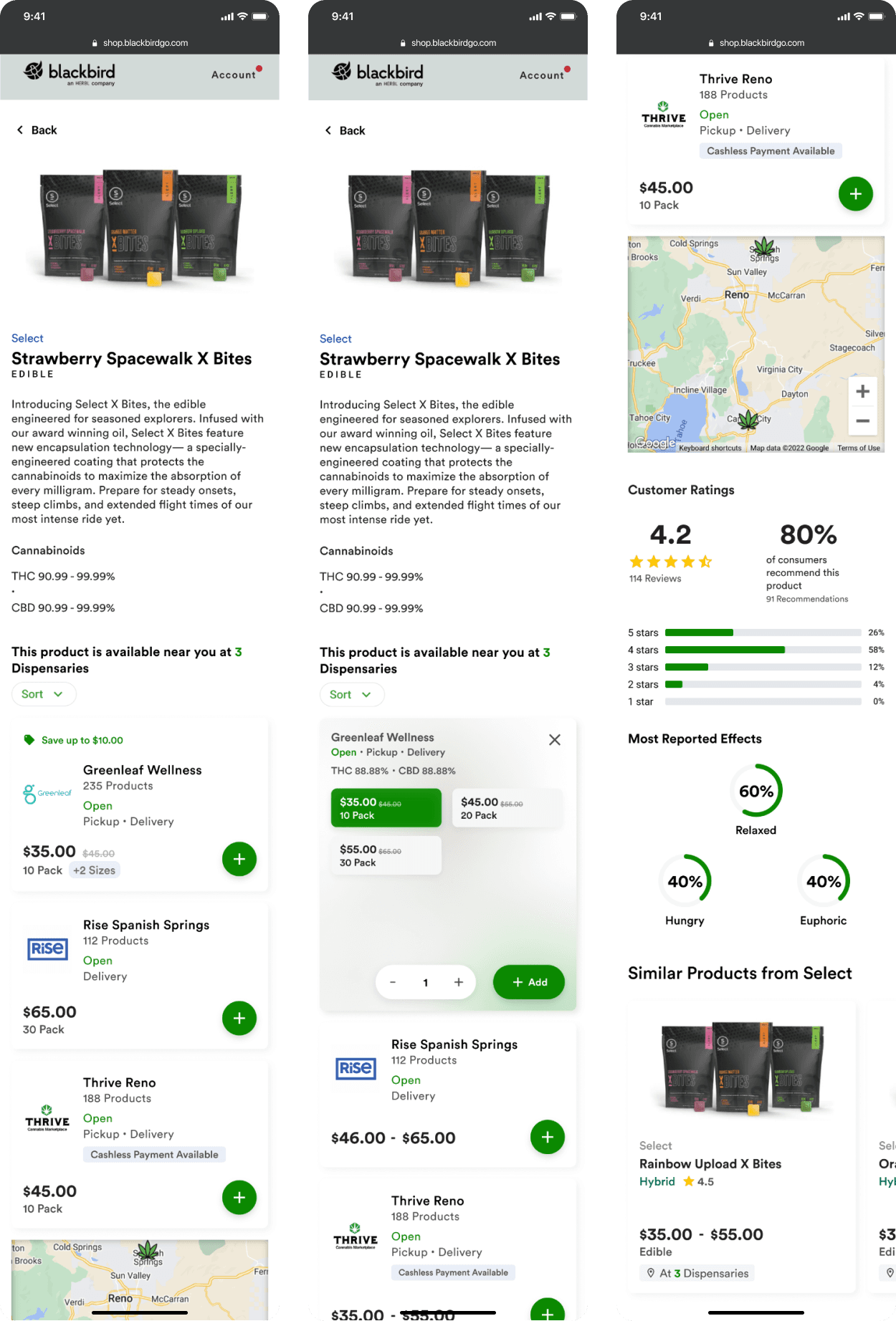
Revamped Screens — Mother Products
Mother Product Pages have been of little use to shoppers before this update - they could add to cart, but a funnel for dispensary order fulfillment wasn’t fleshed out.
In addition to building out the flow for adding to cart, we wanted to surface a lot more product detail like available variants, pricing, sales, cashless payments, etc. We had all of the information readily available, but weren’t surfacing it in any way.
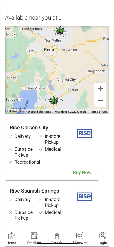
Now shoppers could easily compare prices across dispensaries on at a high level to make the best decision based on their needs/wants.
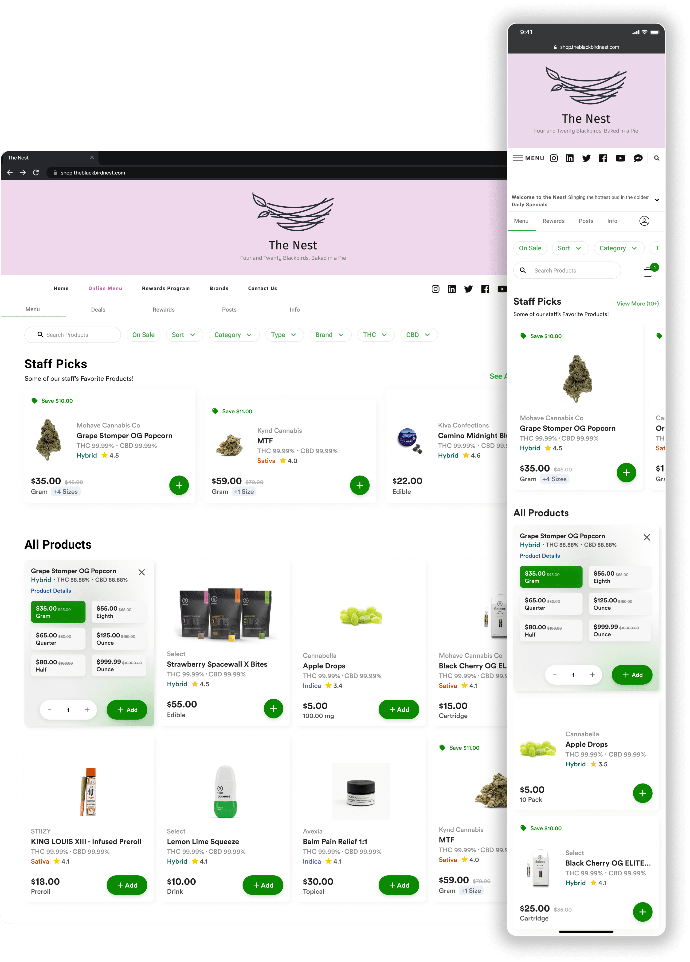
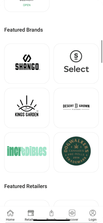
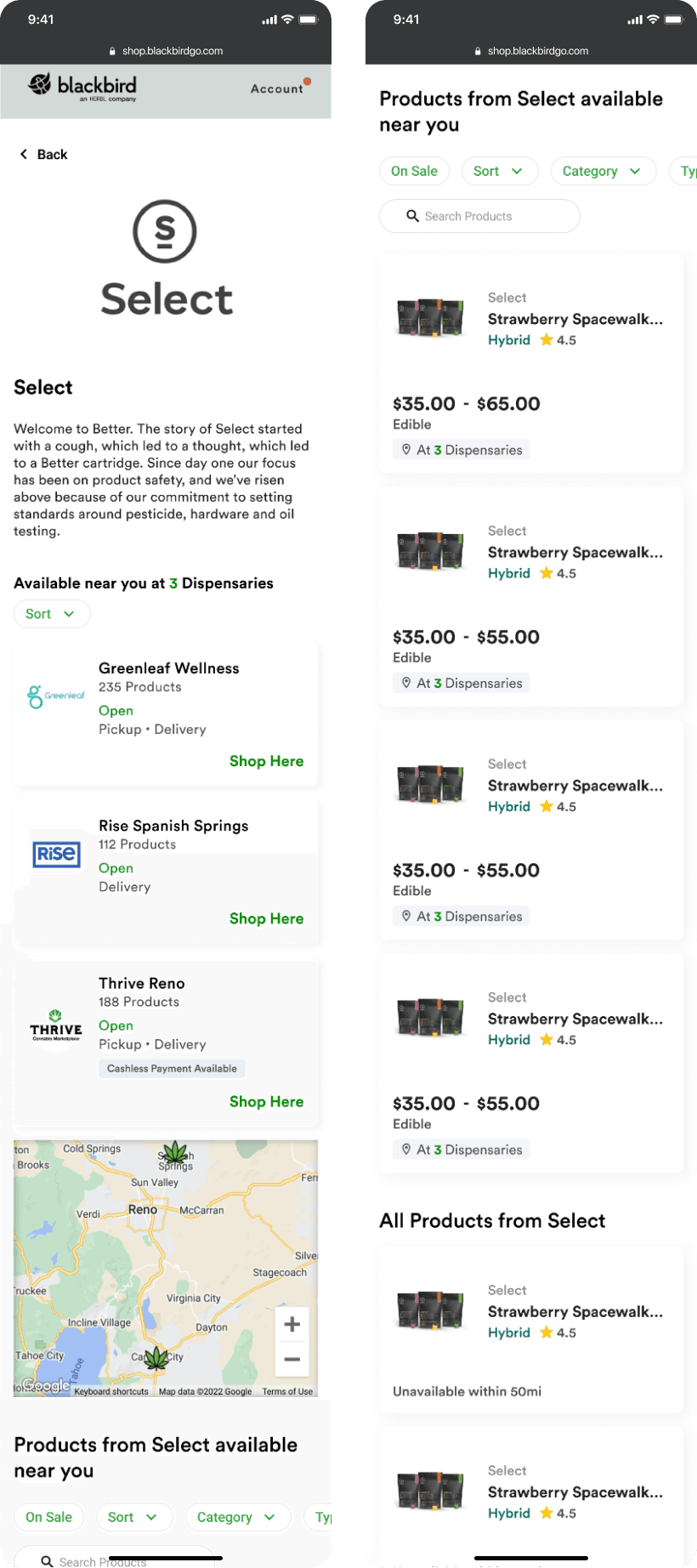
Revamped Screens — Brand Pages
Brand pages would also receive updates as part of this project. Mother product tiles received an update with price ranges and availability counters. We also added filters and product searching to brand pages.
Back to Home